Campus is getting a facelift
Campus is getting a facelift
Here’s how and why we gave Campus the biggest makeover ever…
Here’s how and why we gave Campus the biggest makeover ever…
We’ve been building, using, and selling Campus for just over three years now and learned so much from our customers in that time about how they use the product, what they think about it, and how they think it could be improved.
So, whilst taking that on board, for the last 12 months, we’ve been working hard on:
1 - A greatly improved user interface (well, actually, a complete redesign).
2 - Adding a bunch of new features that will help your marketing and selling to schools and importantly improve how you build relationships with your education contacts.
3 - Refactored lots of the code base to make it easier to add bigger and better features going forwards.
Our goals were simple: Improve the usability and performance of Campus; establish more consistent design patterns across the software and provide features that help you on a day to day basis and also help you build great relationships with teachers.
It’s been a massively rewarding experience and we’re super-excited about the launch which will happen soon; we’re now in the testing phase, so keep your eyes peeled.
There's nothing like using a product every day to get a sense of what's important and what's noisy. It’s not actually widely known by our clients, but we at Sprint use Campus to run our business. For that reason we’ve been especially picky about subtracting the noise and simplifying the user experience. The design changes made throughout the product run deep and I'm excited for you to finally see them! Here are the main ones:
Colour scheme
Our new colour scheme is lighter, brighter, and ties in more closely with our actual website and branding. It was felt that Campus looked like it had been built by a company other than Sprint owing to how differently it was branded compared to our website. Now you can clearly see the link. It’s meant getting rid of a lot of the background grey and introducing much more white which really cleans up the feel of the software. Lots of the clutter has been removed including losing a lot of the unnecessary icons (icons were cool 4 years ago - now they're not!)
Main Navigation and sub navigation
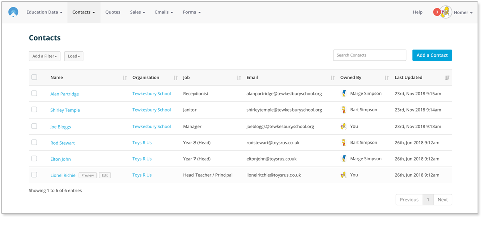
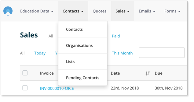
We had a lot of comments about the way people navigate around Campus and how that could be improved. We listened! You’ll be used to seeing a bunch of icons down the left hand side of your screen which, once you click, takes you to the dashboard of the module that you want to access. We’ve done away with those dashboards and instead you have a much improved main dashboard (more on that in a later blog).
Basically, navigation now makes much more sense…
You have a top navigation bar with dropdowns and then sub navigation items only where strictly necessary. It’ll cut down on the number of clicks you need to make and the distance you need to drag your mouse around. It also means you don’t have to wait for unnecessary pages to load before you can get to where you want to be.
Slide in Side Panels
Why should you have to go and load a new page to edit or preview something? That’s right, you shouldn’t. We’ve massively improved the user experience with Slide In Side Panels (admittedly quite a mouthful and so are referred to as ‘SISPS’ amongst our development team). These panels slide in and out with information whilst allowing you to still see (and crucially, interact with) the base information behind it. We’ve used SISPS all over the place and in most instances have replaced the pop up windows (that we call modals). Going forwards modals will only really be used to interrupt a workflow, e.g. when you're performing a destructive action like trying to delete a contact.

Improved Data Tables
We’ve built and implemented a much slicker and less cluttered way of displaying your data in tables.
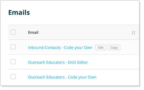
The new table provides you with options when you hover over the row. There’s now no need to show you 10 identical edit, delete, and view buttons all at once! All new tables also come with the ability to delete multiple items. That will save you a lot of time.
We’ve also rolled out the ‘copy’ item feature (that currently only exists in the email table) so you can copy items in all data grids with ease going forwards.
One Place for Your Campus Settings
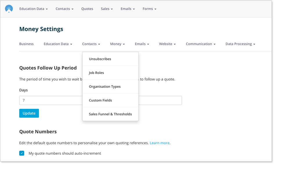
Currently, your Campus settings are pretty dispersed. As an example, to go change your sales settings you have to navigate to the money module and then go to settings. If you then want to change some email settings you have to up sticks and navigate to the Email module, you get the picture… it’s quite a faff. To combat this we've created one single settings centre to administer all your settings.
Improved entity views
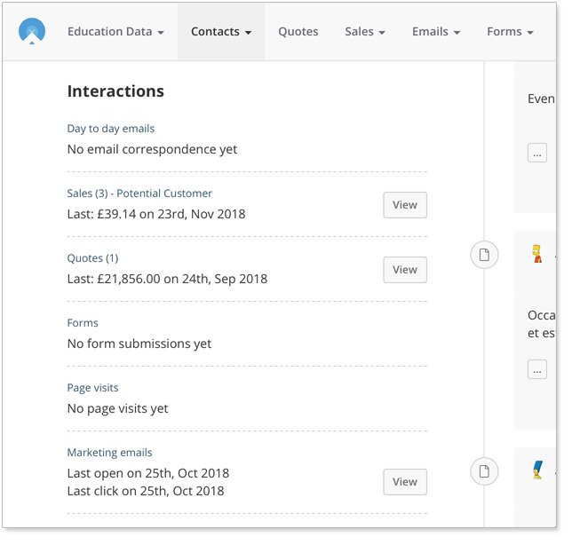
Viewing contacts, organisations, quotes, and sales just got a lot better. We now include much more pertinent information about each entity and enable you to load in lots of supplementary information with SISPS. That includes the linked education data, your marketing funnel points, sales, quotes, form submissions, day to day emails, marketing email interactions, and page visits.
I hope you can already see that Campus is going to be an absolute joy to use. Keep a watchful eye out for our new Knowledge Base articles which run you through the new features.
Stop Press!
The Knowledge Base articles where you can read about all the brand new features can be found here.
Tags
Campus
Similar Articles


Campus Updates at a Glance
International Schools data is coming! Plus, our latest email build features.


Education Email Reporting Revolutionised
Campus Revolutionises Education Marketing with Groundbreaking Email Reporting System


Expert marketing to schools support and solutions
Expert marketing to schools solutions
Email Head Teachers, Teachers, and Staff Inboxes
Email teachers and staff inboxes
Sell More to UK and Global Schools and Colleges
Sell more to schools and colleges


