


![Can You Plug The PSHE Gap in Schools? [5 Top Tips]](https://www.sprint-education.co.uk/uploads/blog/140x105/pshe-plug.svg)


11 Ways to Increase Click-Through Rates
11 Ways to Increase Click-Through Rates
How can you make your call to action buttons more 'clickable' so teachers are powerless to resist clicking through to your website?
How can you make your call to action buttons more 'clickable' so teachers are powerless to resist clicking through to your website?


We’ve all experienced that sinking feeling when you see the engagement stats from your recent marketing to schools campaign and realise that only a handful of teachers clicked a link through to your website. It’s not a nice feeling, especially when you’ve spent ages concocting a superb free resource that’s just sat on your website begging to be downloaded.
In this blog we’re going to look at 11 really easy ways you can make your call to action buttons more ‘clickable’ so teachers are powerless to resist clicking through to your website.
1. Valuable, actionable copy
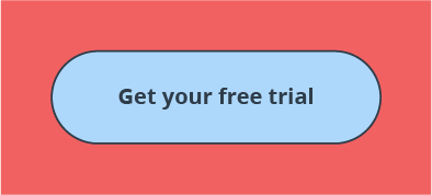
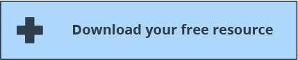
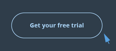
Avoid button copy that’s too pushy or infers a high level of commitment, such as ‘Buy Now’. Instead use actionable copy that conveys great value, such as ‘Download Now’ or ‘Get Your Free Trial’.

2. Colour Contrast
Avoid colours that blend in too seamlessly with the colour scheme of your website or email. Make sure your button sticks out like a sore thumb and immediately draws the eye.
3. Short, snappy text
The more text on your button, the less ‘clickable’ it will look. Try keeping it between 2 – 4 words wherever possible, otherwise it will begin to look more like a heading than a button.

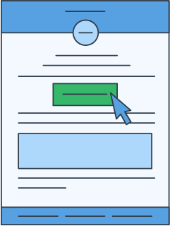
4. Above the fold
Make sure that a teacher doesn’t need to scroll down in order to see what you want them to do with your email. Make sure your button is positioned ‘above the fold’ so that it’s visible as soon as the email is opened.

5. Align to the teachers’ funnel position
Perhaps most important of all, make sure that what you’re asking teachers to do is realistic given their position in your sales funnel. A teacher who has never heard of you will respond much better to ‘Download Your Free Guide’ as opposed to ‘Order Now’.
6. Keep to one CTA per email
Try to avoid the temptation to promote multiple things within the same email. Decide what one single action you want teachers to take from this particular email and focus everything around that.
7. Don’t embed them in an image
Our research shows that Outlook is still one of the top email clients being used by teachers receiving your email. If, as is likely, Outlook is set up to not automatically download your images, any calls to action embedded in those images will not be immediately visible.

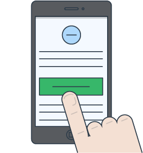
8. Bulletproof Buttons
A bulletproof button works so well because the entire button is 'clickable', not just the text sitting within it. These buttons are particularly effective for teachers viewing your email on mobile devices because they are so much easier to click.
This function isn’t fully supported across all email clients yet, but if you don’t mind a little variation in button appearance, then this is a great addition to your coding tool belt.
9. Fade-Out Buttons
These are buttons with a hover effect – once you move your cursor over the button the colour will change, thus enticing the user to click through to the desired landing page. What’s great about them is that they confirm to the user that ‘Hey, you’re in the right place – go ahead and click me’.
Although these don’t animate in Outlook just yet, we’re keeping our fingers crossed for future support. In the meantime, including them will still make your call to actions really pop in other clients.
10. Use Personalisation
A great way to increase click through rates is to use some personalisation in the text on your button. This is something we do regularly when designing campaigns for clients that target teachers of many different subjects; for example ‘Get Your Free %%subject%% Resources’.

11. Surround it with white space
Surrounding your button with lots of white space is a great way to help draw the eye to your call to action. If the area around your button is too crowded then it’s too confusing for the eye and teachers’ attention will be drawn away from where you want it to be.

The vast majority of these 11 tips are really simple and straightforward to implement the next time you email teachers directly. Many of them may seem like common sense, yet are so easy to overlook when so much of your time and effort is being spent getting the subject line just right, selecting the right images, and honing that oh-so important opening paragraph.
Tags
Email Teachers
Marketing to Schools
School Emails
Selling to Schools
Similar Articles
Groundbreaking New Marketing to Schools Email Tracking
Never settle for outdated notions about email tracking again. Be certain about what works with next-level marketing to schools campaign reports.

Learn to read the room with Sprint’s Education News, only on Campus Resources!
Discover why keeping up on Education News really matters to the success of your selling-to-schools campaigns.


Expert marketing to schools support and solutions
Expert marketing to schools solutions
Email Head Teachers, Teachers, and Staff Inboxes
Email teachers and staff inboxes
Sell More to UK and Global Schools and Colleges
Sell more to schools and colleges
